

Italian restaurant located in Argentina known for its warm atmosphere
and friendly service with lack of information and old-fashioned website.
Cantina Chichilo


Website Redesign for a better User Experience and Business Improvement
Cantina Chichilo is a traditional Argentinean restaurant located in Buenos Aires. The restaurant has been serving delicious Italian and Argentinean cuisine for over 65 years. The menu features a wide variety of dishes, and the restaurant is known for its warm atmosphere and friendly service.
The restaurant's current website is outdated and does not reflect the quality of the dining experience. The website is difficult to navigate and the information is not organized in a user-friendly way. The website also does not feature any high-quality photos or videos of the restaurant or its food.
The objective of this project is to redesign the Cantina Chichilo website to create a more user-friendly and visually appealing experience. The new website should be easy to navigate and should provide users with all the information they need about the restaurant, including its menu, hours of operation, location, contact information, a booking system and a redirection to the delivery app to get the most of the business.
Project Overview
UX/UI Design
User Research
Figma
Role
Re-Design Process
Define
Research
Analyze current
Design
Define
Objectives and Problem Definition
The main objectives of users when visiting the website are to:
Learn about the restaurant's menu, hours of operation, and location. The website's homepage prominently features the restaurant's menu, along with links to information about hours of operation and location. This suggests that users are likely to be interested in learning more about the restaurant before making a reservation or visiting in person.
Make a reservation. The website has a dedicated page for making reservations, which is easy to find and use. This suggests that users are likely to be interested in making a reservation for dining at the restaurant.
Learn about the restaurant's history and culture. The website includes a section about the restaurant's history and culture, which is likely to be of interest to users who are curious about the restaurant's background.
Reading reviews of the restaurant. The website includes a section for reviews, which users may find helpful in making a decision about whether to dine at the restaurant.
Problem Definition:
The user can identify the restaurant's name on the website, but there is no information about its history or ownership.
Contact information (reservation phone number and email address) is available but disorganized and presented in plain text with random color definition or pattern.
Opening hours are duplicated, not obvious where to find it and the location is only listed in text.
Additionally, the website does not provide any information about the menu, delivery options, reservations, or pricing
Suggestions for improvement:
The website could include a section about the restaurant's history and culture. This would help users to learn more about the restaurant and its background.
Contact information should be organized in a clear and concise way. This would make it easier for users to find the information they need.
Opening hours and location should be presented in a more visually appealing way. This would help users to remember the information.
The website should include more information about the menu, delivery options, online reservations, and prices. This would help users to make informed decisions about whether to dine at the restaurant.
By making these changes, the Cantina Chichilo website could provide a more user-friendly and informative experience for visitorsations, or pricing
Research
Does it comply with web accessibility standards, such as the WCAG?
Is the website's structure and layout clear and consistent?
Is the website's content relevant and user-focused?
Does the website load quickly on different devices and internet connections?
What are current users' opinions or rating? Are there recurring complaints or suggestions?
How is the information organized on the websites of the competition?
To check if the website complies with WCAG standards, the WAVE Web Accessibility Evaluation Tool has been used to scan for accessibility issues and found several errors such as:
Images missing alt text
Blinking content and <marquee> elements with scrolling text that the user cannot stop
Very low contrast (3.99:1) between some text and background colors
Style Guide

In selecting variants of Red and Green as the primary colors for Cantina Chichilo's website, it's been carefully considered both the essence of the Italian flag and color psychology.
Colors of the Italian flag. This makes them instantly recognizable and associated with Italy
Complementary colors. This means that they contrast well with each other and create a visually appealing effect
Positive psychological associations. Red is associated with excitement, passion, and energy. Green is associated with nature, growth, and new beginnings.
Associated with Italian food. Red is the color of ripe tomatoes, while green is the color of fresh basil
By using variants of red and green effectively, an Italian restaurant website can create a visually appealing and engaging experience for users
User Flow

Mockups
Navigation Menu
Logo and Home button: redirect to Homepage and scroll to Landing section
Who are we (Quiénes Somos): Scroll to section in Homepage
Menu (Carta): Redirect to Carta page. New page previously non-existing
Booking / Reservations (Reserva): Redirect to Booking page. New page previously non-existing
Delivery: External reditection to 3rd party delivery through Pedidosya website.
Contact: scroll to form in Homepage

Landing section
In the design of the landing section, several key principles have been considered:
Visual Appeal: Visually engaging, with a harmonious color palette, high-quality images or graphics, and Maradona as a resource, due to his love and review of the restaurant.
Call to Action (CTA): Includes 2 CTA buttons that encourages users to Book a Table or Delivery Order.
Brand Consistency: Style aligns with the overall brand identity, including logo placement, color schemes, and visual elements such as ingredients.
Who Are We
Curated a selection of historical photographs of the restaurant's founders and original chef to showcase the restaurant's rich history and heritage.
Carefully composed a descriptive narrative to accompany the photographs, highlighting the restaurant's milestones and the contributions of its key figures.
Strategically integrated the photographs and narrative into the "Who Are We / History" section of the restaurant's website homepage, to create an engaging and informative experience for visitors.
Rating & Reviews
Designed and developed a review carousel to prominently feature the restaurant's high ratings from trusted sources such as Google, TripAdvisor, Yelp, and Facebook. This new and innovative feature, which was previously unavailable on the website, can help potential customers make informed decisions about whether or not to dine at the cantina.
Carefully considered the user experience making it easy for visitors to find and read the reviews, and also wanted to ensure that the carousel was visually appealing and integrated well with the rest of the website design.
Chose to use a carousel format as it is a familiar and user-friendly way to display a large amount of information in a compact space. The carousel is also responsive, meaning that it will look good and function well on all devices, including smartphones and tablets.
Location, Opening & Contact
Location - Embedded a clickable-map on the website to clearly and visually show the restaurant's location so that users can easily find the best route to the restaurant, taking into account their current location and transportation mode. This is a significant improvement over the previous version of the website, which only showed the address in text format.
Opening Hours - New and organized diagram to facilitate understanding of the restaurant's opening hours by day of the week. The diagram is prominently displayed on the Homepage and is easy to read and interpret, including visual cues, such as different colors and symbols, to make it even easier for users to understand the information.
Closed state shown in color brown
Lunch opening state shown in color red + Sun icon
Dinner opening state shown in color green + Moon icon
Contact form - New contact form section to the website, providing users with another way to get in touch with the restaurant besides using the sticky WhatsApp icon that is always displayed on the screen.
The form is easy to use and only requires users to provide their name, email address, message, and company if applicable.
Book a Table
New and innovative online booking system on the restaurant's website. The new booking system allows users to reserve a table directly from the website. This is a significant improvement over the previous system, which required users to call the restaurant to make a reservation.
The new booking system is easy to use and convenient for both users and the restaurant.
For users, the system allows them to make reservations at their own convenience, 24/7. Additionally, the system reduces the risk of errors, as users are responsible for entering their own reservation information.
For the restaurant, the new booking system reduces the workload on the staff and allows the restaurant to collect data on customer reservations.
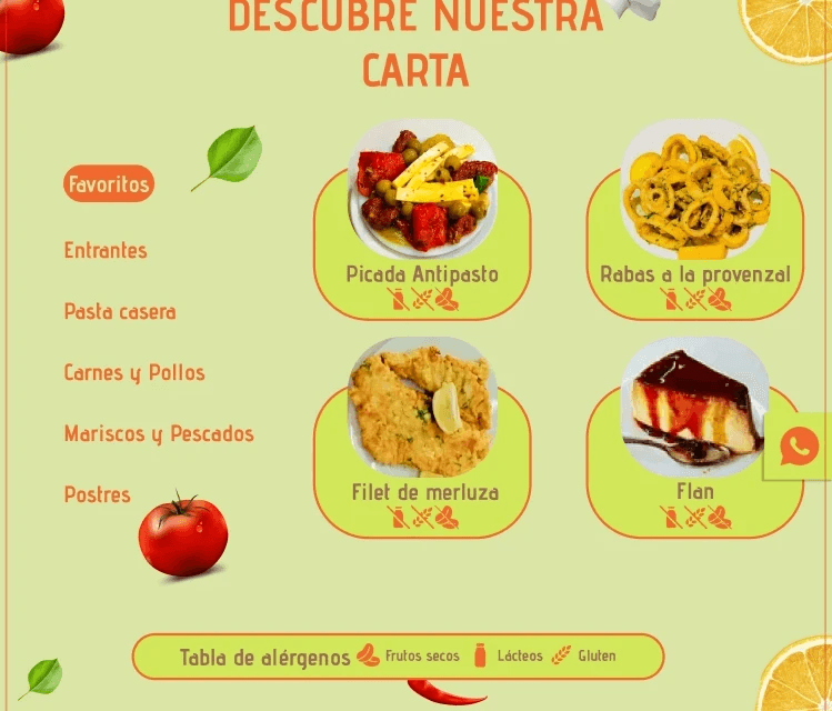
Menu
Separate and dedicated page to display the restaurant's menu with different sections (starters, 1st/2nd dishes, dessert, most popular) as opposed to presenting it on the homepage without a clear organization, as was the case with the previous website.
Retained the original images of the restaurant, although there is a plan to update them with more professional photographs as part of an enhancement.
Delivery
Introduced an exciting addition to the website by incorporating a dedicated "Delivery" section into both the navigation menu and the homepage's compelling CTA buttons. These seamlessly integrated elements are designed to automatically redirect users to an external platform, offering an entirely new dimension to our online presence.
It's a strategic move aimed at enhancing the overall customer experience, expanding our reach, and ultimately driving business growth. This not only streamlines the process for customers to order and receive their favorite items but also demonstrates a commitment to staying up-to-date with the latest industry trends and catering to the evolving needs of our clientele.